JAMB Economics 2016 Objective — Question 15
Question 15 of 40 from the Joint Admissions and Matriculation Board (JAMB) Economics 2016 Objective paper, with the correct answer and a full explanation.
Advertisement
The graph above represents
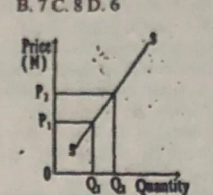
- A. a decrease in quantity supplied
- B. an increase in supply
- C. a decrease in supply
- D. an increase in quantity suppliedCorrect
Explanation
The graph shows price rising from P1 to P2 with a corresponding increase in quantity supplied from Q1 to Q2 - i.e. an increase in quantity supplied.
Advertisement
Sign up free to unlock
- Score tracking
- Practice history
- Saved questions
- Progress dashboard
- Personalized sessions
- Weak-topic breakdown
…and/or go further with premium services and No Ads.